6 months ago, I had just finished creating my first SaaS: the French Together app.
My goal was simple: launch it and reach $20k MRR.
Writing this, I can’t help but laugh.
$20k MRR for a first SaaS? Really?
Only 2 types of people would set such an ambitious goal:
- Someone who never launched a SaaS
- Someone who launched hundreds of SaaS
Let’s find out how it went, shall we?
The big launch

Since the French Together app was my first SaaS and my first real programming project, I decided to go slowly and launch it in 3 phases:
- Phase 1: Give free access to the app to people who bought the ebook course in 2022 in order to get feedback and make sure the app doesn’t crash.
- Phase 2: Switch half of my evergreen email launch to promoting the new app instead of the course.
- Phase 3: Launch to my 90,000 email subscribers.
Back in May when I wrote my last retrospective, Phase 1 and 2 were completed and I was about to do the scariest part: the big launch.
I decided to go for a good old-fashioned email launch and offer the following bonuses to students who sign up for a free trial:
- First 200 students only - The list of the 100 most common French words with example sentences from everyday life.
- All students: 100 expressions that’ll help you sound more French (comes with audio recorded at slow and normal speed.)
The Phase 2 evergreen launch was converting at 2.64% so I was hoping for a similar conversion rate.
2.64%*62,439 email subscribers = 1,648 email signups.
With a mix of monthly and annual sales, this would equal a MRR of roughly $20K.
As often with very ambitious goals, things didn’t exactly go as planned.
The first day of launch went great. The 200 spots for the limited bonus filled up quickly and I received encouraging feedback. Day 2 wasn’t bad either.
By Day 3, trial signups had slowed down. Not unusual for a launch, there is often a dip in the middle, and I knew there would be a surge of signups in the last 72 hours of the launch.
Except there wasn’t. The launch just fizzled out.
By the time the launch ended, trial signups had almost entirely stopped.
At the end of the launch, I had:
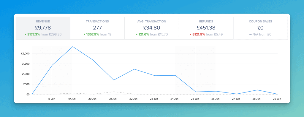
- 300 trial signups (0.48%)
- 84% trial to paid conversion rate
- 252 paid conversions (128 annual, 124 monthly)
Not quite as earth-shattering as expected but still, I had reached $2k MRR.
There was one question I needed to answer though: How come the evergreen launch converted at 2.64% while the general launch converted at a measly 0.48%?
My guess is it’s all about the audience.
The evergreen launch goes out to new email subscribers. These are people who just found French Together and are at peak motivation. They are about to travel to France or just moved there. Learning French is top of their mind.
The general launch went to the main French Together email list. Many of these people have been learning French for years. Learning French may have been a priority when they signed up but it’s now one of many goals. For many of these people, the French Together is simply a way to say they haven’t given up on their French dream.
The after launch and terrifying slow ramp of death

The period after a launch was a mix of excitement and dread.
Excitement because I now had a SaaS and quite a few happy users.
Dread because the long, slow, SaaS ramp of death was looming in the background.
To keep growing, I needed to not only keep acquiring customers but also reduce churn.
Luckily, I still had my evergreen launch funnel. Every day, roughly 100 people were signing up for the French Together newsletter and going through the evergreen launch. And every day, roughly 2.64% of these subscribers were signing up for a free trial.
With churn at a worrying 12.2%, I knew this would be sufficient to maintain my MRR but growth felt like a distant dream.
The solution to this problem was obvious. I needed to:
- Convince more people to sign up for a free trial
- Reduce churn
I decided that the best way to achieve this would be focusing on 2 key projects:
- Improving the app sales page.
- Identifying the main churn reasons and fixing them.
A new sales page and a 143% increase in trial signups
The app sales page was the same sales page I had been using for the ebook version of what would become the French Together app. It converted pretty well but I knew I could improve it.
The problem was that I had tried (and failed) to do just that for years. I needed help.
Not quite sure how it would go but knowing I needed to try something new, I purchased a video audit from SNAP Copy.
The audit exceeded all my expectations and gave me lots of concrete ideas to revamp the page. Here are the main changes I made:
- I rewrote the intro to make it about the reader rather than about French learners in general.
- I made the value proposition clearer and mentioned it more consistently.
- I added a ton of testimonials.
You can see the original page here and the new one here.
I had a new sales page but something was still bothering me.
The French Together blog gets over 200k monthly visitors, yet only a tiny portion of these visitors sign up.
It would go like this:
Visitor visits blog => subscribes to the newsletter and goes through evergreen funnel => buys course/signs up for free trial.
This longer funnel was necessary back when I was selling a course because blog visitors were not ready to immediately spend $129.
But since I was now offering a free trial, I figured people would need less convincing.
I decided to give it a try and shorten the funnel. I kept the email optin forms but added more CTAs on the blog.
- I made the primary header sticky, and added a big CTA button,
- I removed the featured image under blog post titles and replaced it with a CTA
- I added a CTA bar directing people to the sales page
I also rewrote the sales page CTA to much more agressively highlight French Together’s positioning.
“Tired of endless grammar rules and useless vocabulary?
French Together cuts through the noise and teaches you the 20% of French you need to understand 80% of conversations. "
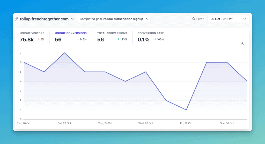
All these changes put together resulted in a nice 143% increase in trial signups.

The churn problem (and the solution)
A 143% increase in trial signups is amazing but I still had a big problem.
As @Patticus would say:
https://twitter.com/Patticus/status/1582370544225173505
I figured the best way to address my 10% churn problem was to find the root cause so I created 2 surveys.
- A welcome survey asking new trial users what convinced them to join and what they were hoping to get out of the app.
- A cancelation survey asking people why they are canceling and what they plan to use instead.
I also set up Gleap to make it as easy as possible for users to report bugs and ask questions so I could quickly identify and fix issues before they cancel.
Thanks to these surveys and user feedback, I identified the biggest cancelation reason: “I’m not a beginner, I need intermediate lessons.”
Which was weird because I did offer intermediate lessons too.
After watching a few SmartLook session recordings and answering a few customer support tickets, the problem became obvious.
- Users often didn’t know how to navigate from lessons to lessons.
- Users didn’t realize they didn’t have to start with beginner lessons and could directly jump to intermediate or advanced lessons.
- Users found finding the right lesson for their level frustrating (or thought such lessons didn’t exist.)
With that in mind, I made the following change.
- I created a “choose your level” button so new user can select their French level and get directed to the appropriate lessons.
- I added a way for students to filter the lessons by level.
- I made the buttons look more like buttons because lots of students didn’t realize they were clickable.
After implementing these changes, churn went from 10% to 6.6%.
https://twitter.com/BenjaminHouy/status/1581204040049823744
Stats, takeaway and November goals
Key numbers
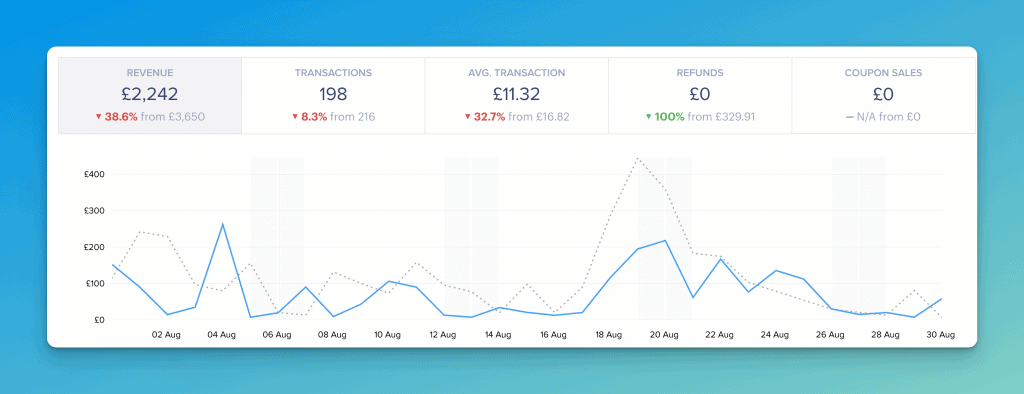
MRR: £3,880
Churn: 6.6%
Month-to-month growth rate: 14.2%
Blog visits: 192k
Writing this takeaway feels weird because the results are much more positive than expected.
The truth is, I spent most of the past 6 months feeling like I was swimming against the tide. I kept making changes but nothing was working. My churn was terrible and new signups were barely making up for the stream of cancelations.
My little SaaS experiment felt like a huge failure and I knew something had to change.
So I decided to do the only thing that felt right.
I closed my laptop, flew to Malaysia and spent 2 weeks eating Nasi Lemak, drinking Ipoh white coffee and trying not to think about my failing SaaS.
Then I came back feeling refreshed and started making changes again. Except this time the changes actually made a difference.
I don’t know what the future holds but I know 2 things:
- When you feel like nothing is working, sometimes the best thing you can do is walk away. Not forever, just long enough to purge old ideas and make space for new ones.
- Part of being an indie founder is accepting that there can sometimes be long periods with no growth or negative growth but you haven’t failed as long as you keep trying.
https://twitter.com/BenjaminHouy/status/1584820915837505537
My goals for November
Test a shorter sales page
When I wrote the first version of the sales page, I had a problem-aware audience in mind.
Based on customer interviews, I knew that most students were aware of their problem (not being able to speak French) but weren’t sure what the solution was. The letter style sales page was meant to help them go from problem-aware to solution-aware.
It has been a few years and the idea of learning conversational French is now much more mainstream, so I wonder if I could bypass the letter part of the sales page and introduce the product and the solution directly.
https://twitter.com/BenjaminHouy/status/1585564279272521733
Test a partial paywall
https://twitter.com/BenjaminHouy/status/1587132963451453442
Improve the Pronunciation Practice
One feature I would like to add is the ability for students to record their pronunciation and compare it to the native speaker. This would also allow me to have an option for students to submit their pronunciation for review by a teacher. This could be a nice feature for a more expensive plan.
Finish CSS for JS Devs
My CSS skills suck and it’s holding me back. I frequently spend days trying to make the app look the way I want. And a lot of it has to do with my lack of a solid CSS foundation.
I started a great course called CSS for JavaScript Developers but lacked time to finish it. My goal for November is to finish it so I can then make the app look great much more easily.
See you in one month!